
In this article
- The Published Requirement: The iOS 26 SDK Requirement
- What Recompiling Does to Your Interface by Default
- The Compatibility Opt-Out Flag and Its Expiry
- Who Faces an Expensive Migration?
- Cross-Platform Apps Face a Different Problem
- Scoping the Work: An Audit Checklist
- The Real Risk: Ratings, Not Rejection
- What to Schedule, and When
- About Baytech
- About the Author
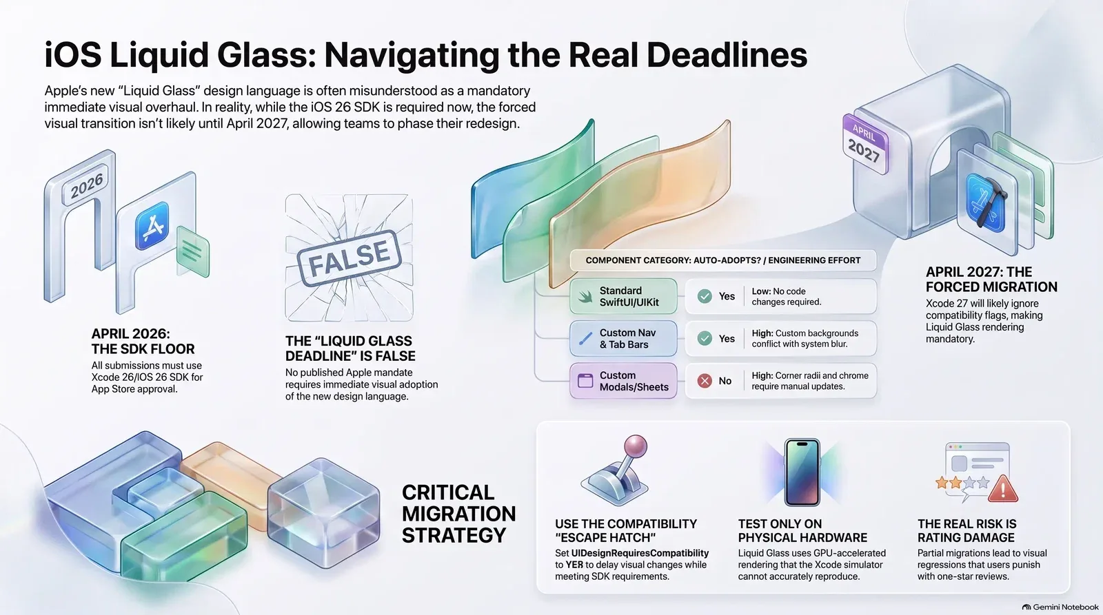
Half the engineering internet is currently quoting an Apple deadline that Apple never published. Development teams are reading vendor blogs and concluding they must immediately rebuild their user interfaces to adopt the new Liquid Glass design language, or face rejection in the App Store. The migration work is entirely real; the countdown attached to it is not.
Confusing a routine toolchain update with a mandatory visual overhaul is exactly how teams end up funding a rushed redesign they could have successfully phased over multiple quarters. Vendor publications have collapsed several distinct elements—an iOS 26 SDK requirement, a default system styling behavior, a temporary opt-out flag, and speculation about future Xcode 27 enforcement—into a single fictional mandate.
Chief Technology Officers need a defensible basis for scoping this engineering work. Your team must plan around Apple's published requirements and the observable behavior of the current toolchain, not secondhand urgency. The underlying transition is genuinely significant for applications with heavy custom styling. Separating Apple's actual App Store minimum SDK rules from the internet rumors is the critical first step in sizing your iOS app redesign cost.
The Published Requirement: The iOS 26 SDK Requirement
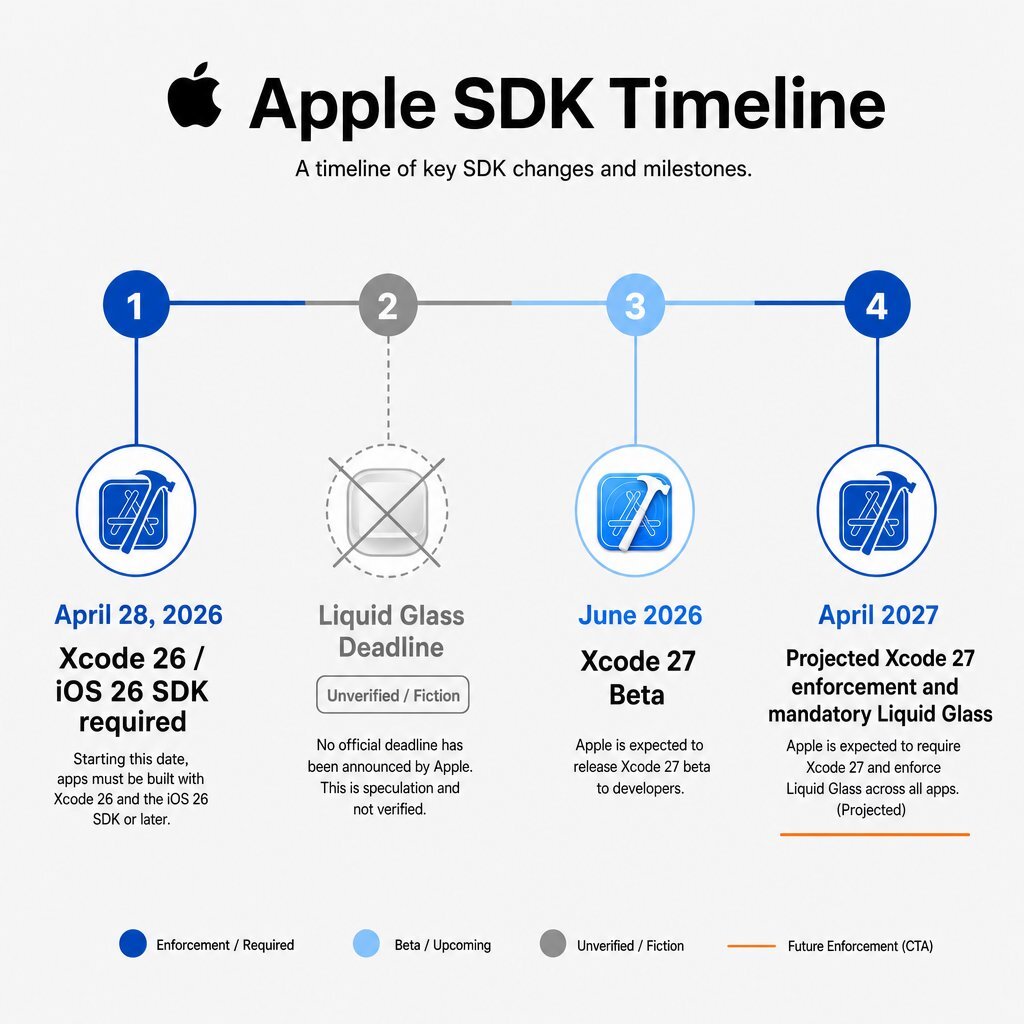
The App Store requirement that Apple actually enforces is an SDK floor. Starting April 28, 2026, Apple explicitly required all new app submissions and updates uploaded to App Store Connect to be built with Xcode 26 and the iOS 26 SDK or later. This baseline requirement represents a standard toolchain deprecation cycle. Apple enforces this to ensure applications remain compatible with current hardware architectures, security protocols, and system frameworks, similar to the way any serious DevOps efficiency program regularly updates its delivery pipeline.
Apple has never published a compliance mandate stating that applications must visually adopt Liquid Glass to pass App Store review. The visual transformation your engineers are seeing is simply a styling consequence of recompiling against the mandatory SDK. Building against the iOS 26 SDK applies the new dynamic, translucent design language to standard interface components by default.
Teams observing their user interfaces breaking upon recompilation assumed Apple was actively rejecting non-compliant designs. The reality is that the new SDK merely renders standard components differently. The rumor of a "Liquid Glass deadline" emerged because developers conflated the mandatory Xcode 26 update with the automatic visual changes that Xcode 26 applies to standard UI controls.
Verified Toolchain Timeline
Executive planning requires verified dates. The table below outlines the factual progression of Apple's SDK enforcement, separating published requirements from unverified speculation.
| Milestone | Date / Status | What Actually Happens |
|---|---|---|
| SDK Floor Effective Date | April 28, 2026 (Active) | Submissions must be built using Xcode 26 / iOS 26 SDK. |
| Liquid Glass "Deadline" | Unverified / False | No published date requires apps to visually adopt Liquid Glass. |
| Xcode 27 Beta Release | June 2026 (Active) | Testing confirms the compatibility opt-out flag is ignored by the compiler. |
| Xcode 27 Migration (Expected) | April 2027 (Projected) | App Store minimum SDK floor advances to iOS 27, effectively forcing Liquid Glass rendering. |
What Recompiling Does to Your Interface by Default
Liquid Glass is not a static frosted overlay. It is a dynamic, GPU-accelerated design material that reflects and refracts its surroundings in real time. Used primarily for interface chrome—such as tab bars, navigation headers, and modals—it seeks to highlight underlying content without obscuring it.
When you recompile your app using the iOS 26 SDK requirement, standard interface elements immediately adopt these new properties. Navigation bars become transparent until content scrolls beneath them. Tab bars shrink into condensed pills when a user scrolls down, floating above the content, and expand when scrolling up. Standard buttons acquire a soft, tactile depth that reacts to the background.
For applications built entirely with system-standard SwiftUI or UIKit components, this transition is seamless. Recompiling applies the new design language automatically with zero code changes. The application immediately feels native to modern iOS devices, which is exactly the sort of incremental, low-risk upgrade pattern we recommend in our phased legacy modernization roadmap.
The Compatibility Opt-Out Flag and Its Expiry
Recognizing that immediate, mandatory adoption of a fundamentally new design language would be impractical for complex applications, Apple introduced a temporary escape hatch. Developers can add a specific Boolean key, UIDesignRequiresCompatibility, to the application's Info.plist file and set its value to YES.
This key acts as a compatibility bridge. It forces the system to render the application using the pre-iOS 26 legacy design language, even when the application is built with the required Xcode 26 SDK. This buys engineering teams vital time. You can satisfy the App Store minimum SDK requirement today without immediately overhauling your visual architecture, much like using a structured discovery phase checklist to stabilize scope before a larger redesign.
The true scheduling constraint teams must plan around is the expiration of this flag. With the release of the iOS 27 Beta, Apple updated its developer documentation to state explicitly that the system ignores the UIDesignRequiresCompatibility key when an application is built with the iOS 27 SDK. Because the App Store SDK floor historically advances every April, teams realistically have until April 2027 before the Xcode 27 migration forces the issue.
Who Faces an Expensive Migration?
The specific failure mode occurs when custom styling meets system components. If your application relies on custom solid backgrounds, explicit legacy shadow properties, or rigid safe-area insets, these elements will fight the Liquid Glass rendering engine. The result reads as half-finished: text bleeds illegibly through supposedly solid headers, or floating tab bars conflict with hardcoded layout math.
| Component Category | Adopts Automatically on Recompile? | Engineering Work Required if Custom Styled |
|---|---|---|
| Standard SwiftUI/UIKit Controls (Toggles, Sliders, Pickers) | Yes | Low: None required, provided custom tinting does not conflict with system specular highlights. |
| System Navigation & Tab Bars | Yes | High: Custom solid backgrounds explicitly block the real-time dynamic blur. Teams must remove legacy backgrounds and adopt new system layer APIs. |
| Custom Bottom Sheets & Modals | No | High: Modals now feature rounder corners and default Liquid Glass chrome. Custom border radius logic conflicts heavily with system defaults. |
| Floating Action Buttons | No | Medium: Standard buttons adopt new depth, but custom floating elements require the explicit application of .glassEffect() modifiers. |
| App Icons | No | Medium: Teams must utilize Apple's new Icon Composer app to generate multi-layered .icon files with custom specular highlights and refraction properties. |
Teams must actively strip out legacy custom backgrounds to allow the system to determine the correct background appearance based on scroll position. Apple expressly warns against overusing the Liquid Glass effect on purely custom controls, recommending that the material be reserved for key interface chrome to avoid diluting content legibility. Treat this refactor the same way you would treat any focused UX design pass: prioritize the surfaces users see most and work outward.
Cross-Platform Apps Face a Different Problem
Applications built on cross-platform frameworks like React Native or Flutter face a distinct challenge. These frameworks bypass standard UIKit components, utilizing JavaScript or Dart to paint custom views to the screen. Because these frameworks do not inherently use Apple's underlying system chrome, recompiling them does not magically yield the dynamic Liquid Glass effect.
For React Native applications relying on libraries like react-navigation/bottom-tabs, the interface remains static while the surrounding OS behaves dynamically. To prevent the application from feeling aggressively non-native, engineering teams must implement specialized bridging libraries. Packages like @callstack/liquid-glass drop in components that render authentic UIGlassEffect panels, reproducing the specular highlights and edge refraction required to match the OS.
Conversely, teams managing healthcare, financial, or data-dense applications must be highly cautious regarding background content bleeding through translucent navigational elements. In these contexts, you cannot afford to have clinical data stylistically blended into a warning modal. Engineers should explicitly set tab bar and header background opacities (e.g., rgba(28, 28, 30, 0.92)) to simulate the glass aesthetic while rigidly preserving the legibility of the data scrolling beneath. The same discipline you’d apply when modernizing high-stakes healthtech applications should guide your Liquid Glass rollout here.
Scoping the Work: An Audit Checklist
To budget accurately, engineering leaders must scope the migration backward from the anticipated Xcode 27 migration in early 2027. Relying indefinitely on the compatibility flag masks structural regressions that exist in your codebase but never surface to QA. Follow this checklist to size the effort and avoid the kind of hidden overruns that often make modernization costs climb after the fact:
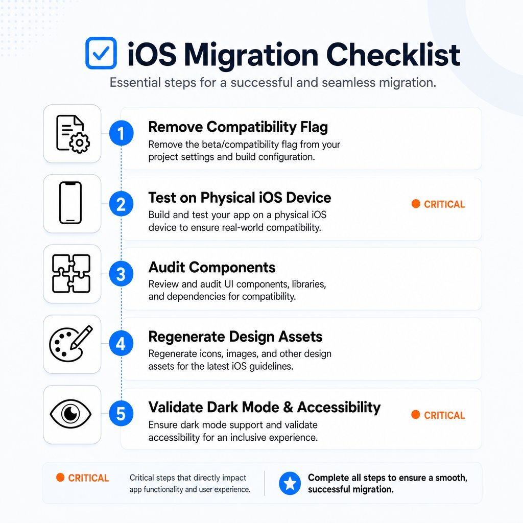
- Flag Removal and Discovery: Temporarily remove
UIDesignRequiresCompatibilityfrom theInfo.pliston a staging branch. Build the application onto a physical iOS 26 device. Hardware-Level Testing: Do not rely on the Xcode simulator. Liquid Glass utilizes GPU-accelerated rendering and real-time motion response. These characteristics do not render with full visual fidelity unless tested on physical hardware.
- Component Audit: Document every instance of a custom-styled navigation bar, tab bar, and modal. Identify where solid background colors are hardcoded and successfully block the system blur.
Asset Regeneration: Engage your design team to rebuild the primary application icon. Use Apple's Icon Composer application to create multi-layered
.iconfiles, dialing in the specular highlights and vertical light angles required by the new OS.Dark Mode and Accessibility Validation: Run a secondary regression pass exclusively in Dark Mode, where the specular highlights of Liquid Glass are substantially more prominent. Open the iOS Accessibility Reader and verify that layouts do not break when system text sizes are maximized.
The Real Risk: Ratings, Not Rejection
The realistic risk of delaying this work is not an App Store rejection. Apple’s automated submission systems will happily accept an application containing the compatibility flag built on Xcode 26.
The actual mechanism of failure is market rating damage. When the compatibility flag inevitably expires upon your adoption of Xcode 27 next spring, the application will forcefully render half-adapted Liquid Glass elements adjacent to legacy solid components. End users notice interface disjointedness immediately. When text bleeds illegibly into navigation bars, or when floating tab bars conflict with hardcoded layouts, the application feels distinctly broken. Consumers review visual regressions harshly, frequently punishing applications with one-star ratings even when core backend functionality remains perfectly intact. This is the same pattern we see when mobile experiences lag behind modern design patterns in B2B apps and portals, which is why we push clients toward a self-service, user-centric roadmap instead of last-minute fire drills.
What to Schedule, and When
The mandate for this current quarter is strict toolchain compliance: upgrade your build pipelines to Xcode 26 and the iOS 26 SDK, test your core user flows with the compatibility flag enabled, and submit your update.
The mandate for the coming quarters is visual architecture compliance. By removing the compatibility flag in staging environments now, you can accurately isolate the broken components and schedule their refactoring across multiple standard development sprints. This phases the iOS app redesign cost over time and prevents a severe bottleneck in early 2027.
Baytech Consulting specializes in custom software development and enterprise application management. Through a Tailored Tech Advantage, Baytech engineers ensure complex legacy systems smoothly adopt current platform technologies without sacrificing stability. Utilizing Agile methodology and Rapid Agile Deployment practices, our teams frequently partner with internal IT groups to conduct comprehensive mobile B2B app audits. Whether you require full mobile application development for a new product or a targeted UX-led review similar to the approach outlined in our piece on the costly truth of skipping UX discovery, Baytech provides the enterprise-grade engineering resources necessary to stay ahead of Apple's unyielding toolchain deprecation cycles.
Frequently Asked Questions
Can Liquid Glass be disabled on a per-component basis while migrating?
No. The UIDesignRequiresCompatibility flag functions strictly as an app-wide, binary escape hatch. The system either renders the entire application in compatibility mode or fully applies the modern Liquid Glass language; selective or per-screen opt-outs using the plist flag are not supported by the OS. If you need more granular control during rollout, you’ll have to design it into your own architecture and release cadence, just as you would for any cross-platform or containerized .NET and Kubernetes deployment.
Supporting Links
- Apple mandates Xcode 26 for App Store Submissions
- Will Apple Make Liquid Glass Mandatory in Xcode 27? What Every iOS Developer Needs to Know
How to use Liquid Glass in React Native
About Baytech
At Baytech Consulting, we specialize in guiding businesses through this process, helping you build scalable, efficient, and high-performing software that evolves with your needs. Our MVP first approach helps our clients minimize upfront costs and maximize ROI. Ready to take the next step in your software development journey? Contact us today to learn how we can help you achieve your goals with a phased development approach.
About the Author

Bryan Reynolds is an accomplished technology executive with more than 25 years of experience leading innovation in the software industry. As the CEO and founder of Baytech Consulting, he has built a reputation for delivering custom software solutions that help businesses streamline operations, enhance customer experiences, and drive growth.
Bryan’s expertise spans custom software development, cloud infrastructure, artificial intelligence, and strategic business consulting, making him a trusted advisor and thought leader across a wide range of industries.